

Adventure
MAGNETS
The magnetism of entertainment is at the core of our brand. Present in our logos and within our visual system, our magnets showcase our attractive nature, focusing viewers’ attention on our high-quality content.
8.01 OUR BRAND’S MaGNETISM
Our magnets are born from our logo, dynamically revealing messaging and content and pulling our audience’s attention.
For guidance on the animation of our magnets, please refer to the Motion Theory page.
Our magnets are born from our logo, dynamically revealing messaging and content and pulling our audience’s attention.
For guidance on the animation of our magnets, please refer to the Motion Theory page.
8.02 COLOUR
Our magnets are a core part of our brand, and should reflect the channel’s primary colour where possible. The following guidance shows the best examples of how to use colour when it comes to our magnets.
Our magnets are a core part of our brand, and should reflect the channel’s primary colour where possible. The following guidance shows the best examples of how to use colour when it comes to our magnets.
MAGNETS ON COLOUR
For our Adventure channels, our magnets should be Mint. wherever possible. When on a Mint background, the magnets are Petrol.
White should never be used for our magnet or background colour.

Mint on Petrol background.

Petrol on Mint background.

White on Petrol background.

White on Mint background.
MAGNETS ON CONTENT
On top of content, our magnets should always be Mint.
No other colour is acceptable on top of content.
For legibility, do not use Mint magnets on top of a similarly coloured background.

Mint on darker content.

Mint on lighter content.

White on darker content.

White on lighter content.

Petrol on darker content.

Petrol on lighter content.

Mint on Mint-tintedx content.
8.03 Usage
These examples demonstrate typical magnet behaviours throughout our brand system.
Please refer to the relevant sections for further information and/or downloadable assets.
These examples demonstrate typical magnet behaviours throughout our brand system.
Please refer to the relevant sections for further information and/or downloadable assets.
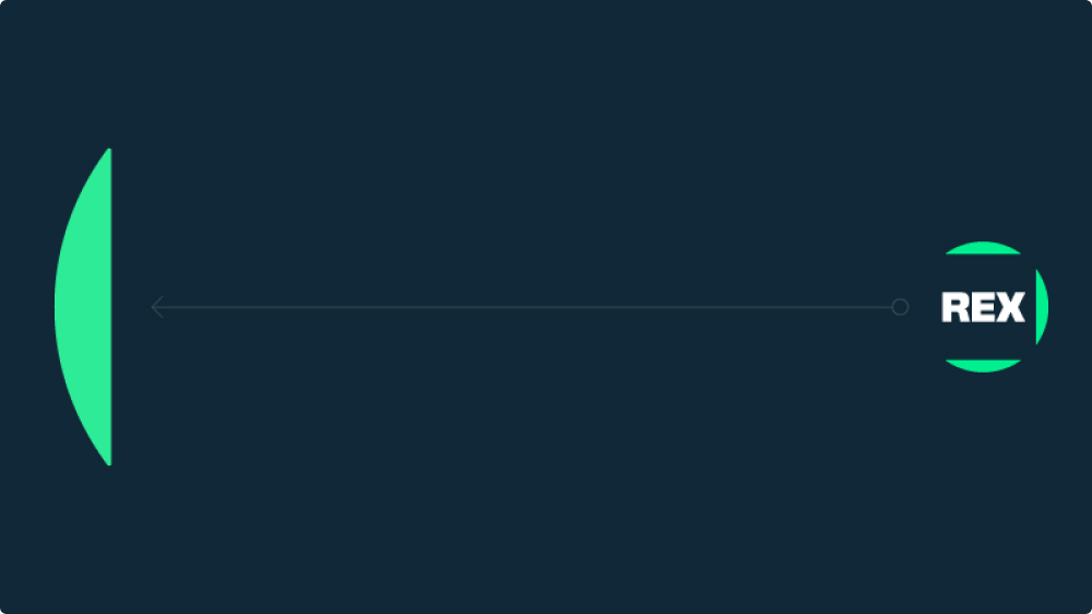
MAGNETS WITH LOGO
When our magnets are used with our logo, one magnet is pulled out and reveals information and/or content. Examples: Menus, Credit Squeezes, IPMs, Digital OOH Marketing.
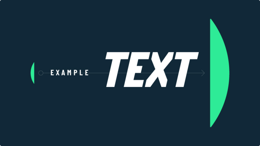
MAGNETS WITH TYPE
Our magnets can be used to reveal type and build a narrative around our content, as shown in our promos. Examples: Type kit within Promo kit.

MAGNETS WITH CONTENT
Our magnets can be used to focus and draw attention when used on top of content. Examples: Promo kit.

MAGNETS WITH CONTENT AND TYPE
Our magnets can be used alongside type and content to enhance storytelling. Examples: Promo kit.
MISUSE
To ensure our magnets are seen consistently across our brand, please avoid the following.

Do not make magnets within the same communication different colours.

Do not add effects to the magnets (e.g. glows or drop shadows).

Do not outline the magnets.

Do not place content within the magnets.

The flat side of our magnets 'attracts' and the curved side ‘repels’. Do not flip the magnets illogically.

Maintain sizing tension with our magnets. Do not make either magnet super small or super large. Do not crop the curved edge of the magnet.

Do not use three magnets.

Do not rotate the magnets.
8.04 MOTION
We want the magnetism and energy of our brand to come across in every motion asset. We have a few simple motion behaviours to help guide this and ensure consistency.
We want the magnetism and energy of our brand to come across in every motion asset. We have a few simple motion behaviours to help guide this and ensure consistency.