

Brand assets
Streaming
Our brand is designed to seamlessly adapt to our streaming platforms. By adjusting typography and colour settings, our brand effortlessly accommodates all current and future streaming brands.
To note:
The following guidance applies across all regions and channels.

17.01 HBO Max
Logo
For all streaming brand assets see respective guidelines for full logo guidance. We should only use the HBO Max logo in White on our assets.

17.02
Stream on lock-up
We have a bespoke ‘Stream On HBO Max’ lock-up which is typically used for bolt-ons and marketing. The diagram below shows the relationship between the type and the logo. To provide a consistent balance between elements, these proportions should be followed where possible.
This is the only case for which we use the typeface that belongs to the streaming platform. Please do not use this typeface for any other brand communication.
17.03
COLOUR PALETTE
For our HBO Max streaming applications we use the Max Blue and our bespoke Streaming Blue. Please see respective assets for specific colour usage.
*Our core brand colours are broadcast-safe. However, when on air, white needs to be adjusted for screens. Only use this value for on-air assets.
-
HBO Max blackR0 G0 B0HEX 000000C60 M40 Y40 K100PMS 6C
-
streaming blueR20 G25 B55HEX 141937
-
WHITER255 G255 B255HEX FFFFFFC0 M0 Y0 K0
-
broadcast WHITE*R235 G235 B235HEX ebebeb
17.04
nordic plate system
Our Nordic Plate System typeface is the only typeface used for our streaming messaging. We have the option to use bold or regular weights to suit the respective application.
- Bold
- Regular


17.05
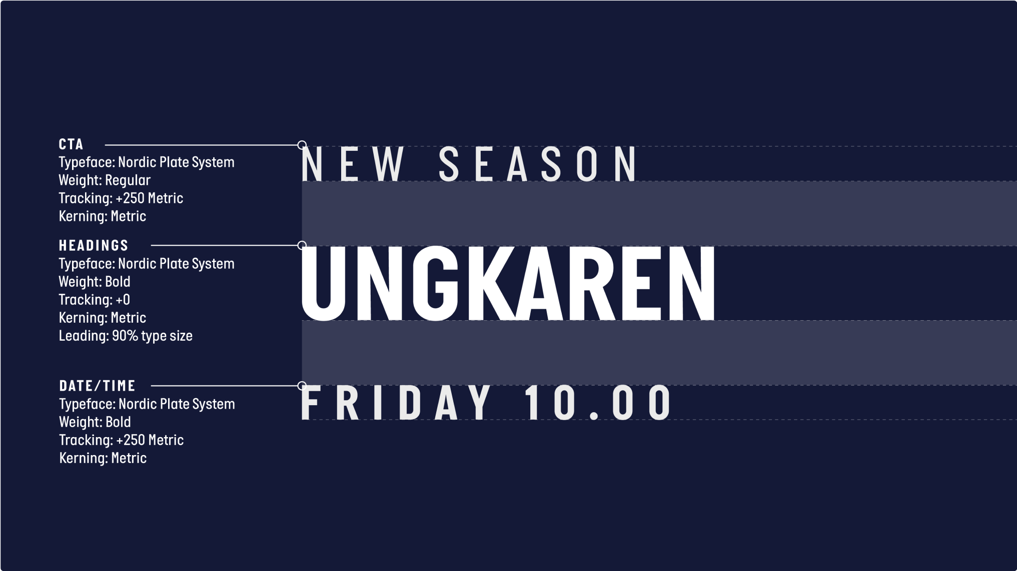
hierarchy
Combining Nordic Plate System Bold and Regular creates separation and hierarchy between information. The typesetting example below demonstrates a typical relationship between our weights.
For exact typesetting values, see respective sections.
17.03
Usage
All type should be White, with Max Blue or White magnets. See magnets section for guidance.
All type should be White, with Max Blue or White magnets. See magnets section for guidance.
17.08
Magnets
Our magnets are a core part of our brand and should reflect the streaming platform’s primary colour where possible. We do not use our streaming colours on top of content.
The following guidance shows the best examples of how to use colour when it comes to our magnets.


17.09 Discovery+
Logo
For all streaming brand assets see respective guidelines for full logo guidance. Whenever used on our assets we should only use the Discovery + logo with the white wordmark.

17.10
Stream on lock-up
We have a bespoke ‘Stream On Discovery+’ lock-up which is typically used for bolt-ons and marketing. The diagram below shows the relationship between the type and the logo. To provide a consistent balance between elements, these proportions should be followed where possible.

Misuse
Please avoid the following instances to ensure our brand remains consistent and looking its best.

Don’t use other colours within the lock-up.

Don’t change the proportions where possible.

Don’t use any other typefaces.

Don’t use sentence case for the message.
17.11
COLOUR PALETTE
For our Discovery+ applications, we use the Streaming Blue as our primary colour. Please see respective assets for specific colour usage.
*Our core brand colours are broadcast-safe. However, when on air, white needs to be adjusted for screens. Only use this value for on-air assets.
-
streaming blueR20 G25 B55HEX 141937
-
WHITER255 G255 B255HEX FFFFFFC0 M0 Y0 K0
-
broadcast WHITE*R235 G235 B235HEX ebebeb
17.12
nordic plate system
Our Nordic Plate System typeface is the only typeface used for our streaming messaging. We have the option to use Bold or Regular weights to suit the respective application.
- Bold
- Regular
17.13
hierarchy
Combining Nordic Plate System Bold and Regular creates separation and hierarchy between information. The typesetting example below demonstrates a typical relationship between our weights.
See respective sections for exact typesetting values.

17.14
usage

All type and magnets should be White. See magnets section for guidance.

All type and magnets should be White. See magnets section for guidance.
Misuse
Please avoid the following instances to ensure our brand remains consistent and looking its best.

Don’t use other channel colours for magnets.

Don’t use other channel colours for type.
17.15
Magnets
Our magnets are a core part of our brand and should reflect the streaming platform’s primary colour where possible. We do not use our streaming colours on top of content.
The following guidance shows the best examples of how to use colour when it comes to our magnets.

White on Streaming Blue.

Streaming Blue on White.

Other channel colours on Streaming Blue.

Any colour on content.