

Off air
social
Our brand maintains its energy and presence across social media platforms. We have both promotional and marketing templates that can be used across appropriate social streams.

22.01 marketing
Across our marketing communications, we have
3 approaches that range from more content-led
to more brand-led.
Our primary approach is Immersive.
Graphic and Full-content should be used where appropriate.
Across our marketing communications, we have
3 approaches that range from more content-led
to more brand-led.
Our primary approach is Immersive.
Graphic and Full-content should be used where appropriate.

Example: Norway.
22.02 instagram post
Our Instagram post templates can be used in any of our 3 marketing approaches for a single IP. Multiple IP layouts are not recommended for social media due to limited space.
The veil in the templates has been created to make sure logos are legible on top of key art. The opacity of this can be adjusted as necessary depending on the key art.
For tagline and streaming lock-up guidance, please refer to the relevant pages.
vertical 1080×1350
- full content
- immersive
- graphic


22.03 instagram story
Our Instagram story templates can be used in any of our 3 marketing approaches for a single IP. Multiple IP layouts are not recommended for social media due to limited space.
The veil in the templates has been created to make sure logos are legible on top of key art. The opacity of this can be adjusted as necessary depending on the key art.
To note: Instagram story templates have a clear space section at the top to allow for the UI of the application.
For tagline and streaming lock-up guidance, please refer to the relevant pages.
vertical 1080×1920
graphic
graphic
- full content
- immersive
- graphic


22.04 key art guidance
The master key art is designed in a 1:1 format with generous clear space and simplified, well-organized layers.
This setup ensures that assets can be created quickly and adjusted effortlessly, allowing each element to be adapted, resized, or repositioned to fit a wide range of deliverables.
All markets can adjust the artwork based on the assets they choose, ensuring consistency while supporting local flexibility.

MISUSE
To ensure our key art looks its best within our templates, please avoid the following instances.

Do not crop into subjects where possible.

Do not overlap content logos onto subject faces.

in a graphic template, do not extend the overlap of the key art too high, causing obstruction of the logo and/or tagline.

Do not rotate key art within its holding frame.
22.05 introduction
This kit offers the flexibility to create Social Promos for all scenarios, with consistency across different types of content and across channels. Here’s an example sequence of how a Social Promo could come together.
Examples shows below are in 1080×1350 format, but are applicable to all sizes and regions.

OPNER

TYPE-KIT

STRAP

ENDBOARD AND BOLT-ON WITH SHOW TITLE
22.06 SOCIAL PROMO EXAMPLE
This is an example of a typical Social Promo. Some elements can be mixed, such as Type-Kit. They can also be added or removed to create variety.
Example below is in 1080×1350 format, but is applicable to all sizes and regions.
This is an example of a typical Social Promo. Some elements can be mixed, such as Type-Kit. They can also be added or removed to create variety.
Example below is in 1080×1350 format, but is applicable to all sizes and regions.
22.07 OPENER
Our Opener ensures the brand and channel logo is always at the forefront. It should be used at the start of a Social Promo.
Example shown below is in 1080×1350 format, but is applicable to all sizes and regions.
Our Opener ensures the brand and channel logo is always at the forefront. It should be used at the start of a Social Promo.
Example shown below is in 1080×1350 format, but is applicable to all sizes and regions.
OPENER EXAMPLES
Please find recommended examples of
our Opener below.
- 1080×1920 schematic
- 1080x1920
- 1080×1350 schematic
- 1080×1350
Applicable to all regions.

Example: 2024.

Applicable to all regions.


22.08
SOCIAL PROMO
TYPE-KIT
Our Type-Kit takes the audience on a journey through content and can provide crucial information and create emotion. There are different expressions available within the Kit, depending on the content’s length and intention. High Expression is impactful and loud. Low Expression is subtler and more functional.
To note: The animation of the Type-Kit is the same for every size and region.
- high exp
- low exp - large
- low exp - medium
- low exp - small

Example: Norway.
HIGH-EXPRESSION
TYPE
TYPE
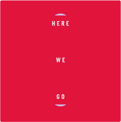
High Expression should be used by default, as it tells our brand story most effectively through the motion of the magnets. It is ideally suited to short, snappy sentences.
Please find examples in the sizes below.
- 1080×1920 schematic
- 1080x1920
- 1080×1350 schematic
- 1080x1350
Applicable to all regions.

Example: Norway.
Applicable to all regions.
Example: Norway.
COLOURS
This type style can be used with a selection of colour combinations, over both graphic and content backgrounds. This ensures brand consistency and legibility.
Examples shown below are in 1080×1080 format, but are applicable to all sizes and regions.

Red background
The red background brings fun, life and excitement to Promos, with a flood of colour.

Charcoal background
The charcoal background helps bring a more sophisticated look, with a pop of colour.

Dark content
With dark content, all white text allows for legibility, with a highlight of our core red.

Light content
With light content, all dark text allows for legibility, with a highlight of our core red.
MISUSE
While the type style is flexible and the Kit is built in a way that’s easy to use, there are certain scenarios that should not be applied in any circumstances – to retain brand integrity.
Examples shown below are in 1080×1080 format, but are applicable to all sizes and regions.

DON’T MAKE THE SMALL TEXT TOO LONG
It will make the sentence confusing, and create less impact.

ONLY USE SHORT, IMPACTFUL SENTENCES
To keep our core brand colours at the forefront of designs.

ONLY USE DIFFERENT COLOURS FOR THE MAGNETS AND TEXT
To keep our core brand colours at the forefront of designs.

ONLY USE CONTENT THAT CONTRASTS WITH THE TEXT
Picking similar tones, or having too much going on, can make the text unreadable.
LOW-EXPRESSION
LARGE TEXT
LARGE TEXT
Low Expression – Large is useful for short, snappy phrases that add impact to Social Promos – as well practical information such as dates for launches.
Please find examples in the sizes below.
- 1080×1920 schematic
- 1080×1920
- 1080×1350
Applicable to all regions.

Example: Norway.
Example: Norway.
COLOURS
This type style can be used with a selection of colour combinations, over both graphic and content backgrounds. This ensures brand consistency, as well as legibility.
Examples shown below are in 1080×1080 format, but are applicable to all sizes and regions.

Red background
The red background brings fun, life and excitement to Promos, with a flood of colour.

Charcoal background
The charcoal background helps bring a more sophisticated look, with a pop of colour.

Dark content
With dark content, all white text allows for legibility, with a highlight of our core red.

Light content
With light content, all dark text allows for legibility, with a highlight of our core red.
MISUSE
While the type style is flexible and the Kit is built in a way that’s easy to use, there are certain scenarios that should not be applied in any circumstances – to retain brand integrity.
Examples shown below are in 1080×1080 format, but are applicable to all sizes and regions.
DON’T CHANGE THE SPACING OF THE MAGNETS
The layout and space between the words and magnets should always be consistent.

ONLY USE IMPACTFUL, SHORT SENTENCES
Long sentences are harder to read, but also create less tension between elements.

ONLY USE DIFFERENT COLOURS FOR THE MAGNETS AND TEXT
To keep our core brand colours at the forefront of designs.

ONLY USE CONTENT THAT CONTRASTS WITH THE TEXT
Picking similar tones, or having too much going on, can make the text unreadable.
LOW EXPRESSION – MEDIUM TEXT
Low Expression – Medium allows for more text within layouts – making it better suited to content that needs more space.
Please find examples in the sizes below.
- 1080×1920 schematic
- 1080×1920
- 1080×1350 schematic
- 1080×1350
Applicable to all regions.

Example: Norway.
Applicable to all regions.

Example: Norway.
COLOURS
This type style can be used with a selection of colour combinations, over both graphic and content backgrounds. This ensures brand consistency, as well as legibility.
Examples shown below are in 1080×1080 format, but are applicable to all sizes and regions.

RED BACKGROUND
The red background brings fun, life and excitement to Promos, with a flood of colour.

CHARCOAL BACKGROUND
The charcoal background helps bring a more sophisticated look, with a pop of colour.

DARK CONTENT
With dark content, all white text allows for legibility, with a highlight of our core red.

LIGHT CONTENT
With light content, all dark text allows for legibility, with a highlight of our core red
MISUSE
While the type style is flexible and the Kit is built in a way that’s easy to use, there are certain scenarios that should not be applied in any circumstances – to retain brand integrity.
Examples shown below are in 1080×1080 format, but are applicable to all sizes and regions.

DON’T CHANGE THE SPACING OF THE MAGNETS
The layout and space between the words and magnets should always be consistent.

ONLY USE SHORT, IMPACTFUL SENTENCES
Long sentences are harder to read, but also create less tension between elements.

ONLY USE DIFFERENT COLOURS FOR THE MAGNETS AND TEXT
To keep our core brand colours at the forefront of designs.

ONLY USE CONTENT THAT CONTRASTS WITH THE TEXT
Picking similar tones, or having too much going on, can make the text unreadable.
LOW EXPRESSION – SMALL TEXT
Low Expression – Small is for instances where the brand doesn’t need to be as prominent – or where other content takes priority. It’s more subtle and sophisticated than the other sizes, putting the emphasis firmly on messaging.
Please find examples in the sizes below.
- 1080×1920 schematic
- 1080×1920
- 1080×1350 schematic
- 1080×1350
Applicable to all regions.
Example: Norway.
Applicable to all regions.
Example: Norway.
LAYOUTS
There are two options for the layout of the words on this version of the Social Type-Kit, for either two or three words. They can be toggled on and off in the working file.
Examples shown below are in 1080×1080 format, but are applicable to all sizes and regions.
COLOURS
This type style can be used with a selection of colour combinations, over both graphic and content backgrounds. This ensures brand consistency and legibility.
Examples shown below are in 1080×1080 format, but are applicable to all sizes and regions.
RED BACKGROUND
The red background brings fun, life and excitement to Promos, with a flood of colour.

CHARCOAL BACKGROUND
The charcoal background helps bring a more sophisticated look, with a pop of colour.

DARK CONTENT
With dark content, all white text allows for legibility, with a highlight of our core red.

LIGHT CONTENT
With light content, all dark text allows for legibility, with a highlight of our core red.
MISUSE
While the type style is flexible and the Kit is built in a way that’s easy to use, there are certain scenarios that should not be applied in any circumstances – to retain brand integrity.
Examples shown below are in 1080×1080 format, but are applicable to all sizes and regions.

DON’T CHANGE THE SPACING OF THE MAGNETS
The layout and space between the words and magnets should always be consistent.

ONLY USE WORDS THAT ARE BALANCED IN LENGTH
One really long/really short word can make the sentence hard to read.

ONLY USE DIFFERENT COLOURS FOR THE MAGNETS AND TEXT
To keep our core brand colours at the forefront of designs.

ONLY USE CONTENT THAT CONTRASTS WITH THE TEXT
Picking similar tones, or having too much going on, can make the text unreadable.
22.09 STRAP
Straps are used over content to promote information about the show, such as when it’s on and the channel, whilst keeping the audience engaged with the content itself.
To note: The positioning and animation of the Strap are the same for every region. Examples shown below are in 1080×1350 format, but are applicable to all sizes and regions.
sequencing
This is an example of a typical Strap, one-show sequence. Multi-show promotion can be added to our toolkit where needed.
Examples shown below are in 1080×1350 format, but are applicable to all sizes and regions.


01 - LOGO ANIMATION

02 - SHOW TITLE, CTA & ATV

03 - STREAMING MESSAGE
LOGO ANIMATION
The layout and motion of the Logo Animation is consistent across all channels. However, the following elements change:
Logo
Please look at the examples below for reference.
- 1080×1920 schematic
- 1080×1920
- 1080×1350 schematic
- 1080×1350
Applicable to all regions.
Example: Norway.
Applicable to all regions.
Example: Norway.
show title, cta & ATV
The layout and motion of the Show Title & CTA are consistent across all channels. However, the following elements change:
Logo
Show Title, CTA & ATV
Please look at the examples below for reference.
- 1080×1920 schematic
- 1080×1920
- 1080×1350 schematic
- 1080×1350
Applicable to all regions.
Example: Norway.
Applicable to all regions.
Example: Norway.
SHOW TITLE LENGTHS
Title lengths can span two lines when needed. In this case, the sizing of elements changes to stay as consistent as possible.
Please look at the examples below for reference.
- 1080×1920 schematic
- 1080×1920
- 1080×1350 schematic
- 1080×1350
Applicable to all regions.

Example: Norway.
Applicable to all regions.
Example: Norway.
HBO MAX STREAMING MESSAGE
The layout and motion of the Streaming message is consistent across all scenarios. However, the following elements change:
Logo
CTA
The example below are reference for HBO Max streaming.

DISCOVERY plus STREAMING MESSAGE
The layout and motion of the Streaming message is consistent across all scenarios. However, the following elements change:
Logo
CTA
The example below are reference for Discovery Plus streaming.


22.10
ENDBOARDS &
BOLT-ONS
Our Endboards and Bolt-ons help summarise the content being shown whilst reinforcing our brand. They can show information about a piece of content , such as when it’s on and where, and excite audiences with the stars.
To note: The positioning and animation of the Endboards and Bolt-ons are the same for every region.
- ENDBOARD WITH SHOW TITLE
- ENDBOARD WITH BRAND FONT
ENDBOARD & BOLT-ONS
Endboards and bolt-ons van be used with both show title and brand font, which allows for both flexibility and brand presence.
Examples shown below are in 1080×1350 format, but are applicable to all sizes and regions.
- BOLT-ON SHOWTITLE
- BOLT-ON BRAND FONT


LOGO CAGE
A logo cage is built into the Endboard kit to ensure balance between all the elements. Here are examples of how different types of logo should look. These are schematic examples.
Examples shown below are in 1080×1350 format, but are applicable to all sizes and regions.

LOGO MISSUSE
While the system is flexible and the kit is built in a way that’s easy to use, there are certain scenarios that should not be applied in any circumstances with the Show Title – to retain brand integrity.
Examples shown below are in 1080×1350 format, but are applicable to all sizes and regions.

ONLY USE THE LOGO IN WHITE
f there isn’t a white option of the show title available, it will need to be created, or use another Endboard version.

CREATE HIERARCHY WITH THE LOGO
Logos that are too small on the page will make the order of information hard to read.

DON’T OVER-SCALE THE LOGO
Use the logo cage to keep the sizing consistent for each Endboard.

DON’T ADD HARSH EFFECTS TO THE LOGO
Adding a subtle gradient behind the logo is fine to ensure readability, but don’t make it obvious.
STREAMING MESSAGE
Both HBO Max and Discovery Plus streaming messages can be placed in the Endboards.
Examples shown below are in 1080×1350 format, but are applicable to all sizes and regions.
- HBO MAX
- DISCOVERY PLUS

Applicable to all regions.

Applicable to all regions.
SOCIAL PROMO KIT OVERVIEW
Our Social Promo kit is a seamless digital-first experience that connects all of our content under one magnetic and unified system. It follows a similar structure as our on-air Promo Kit, and works across three sizes 1080×1920, 1350×1080 and 1080×1080. In all cases, we have used the most extreme social clear zones.
To note: The following guidance applies to all regions.